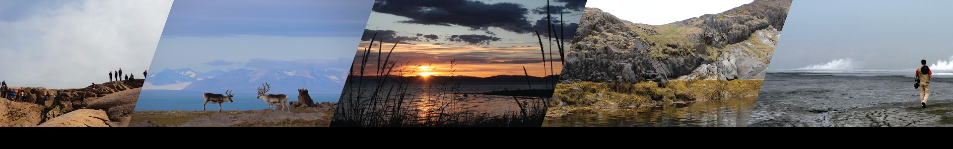

The use of the full "rainbow" of colours is pervasive in science, and often so for common daily societal data such as weather maps and hazards warnings. For many years, the default colouring option in software programs was the rainbow-like “jet”, and many people simply seem attracted to the array of colours that a rainbow offers. “Rainbows are fantastic...”, explains lead author Fabio Crameri, “...but in the context of displaying scientific, technical, medical or similar such data, it needs to be stopped.” This is because the properties of the colours, and the way that the human eye understands them, can lead to distortion. It is therefore not just a problem for scientists, but also for journal editors, visual communicators, journalists, administrators, and society-at-large.

Two such properties that can cause distortion are (non-)perceptual uniformity and order. These essentially refer to the colour and lightness change, and an intuitive colour order, respectively. For example, a scale should generally start (or end) with a lighter shade at one end and smoothly change to a darker shade at the other. This can involve different colours (or hues) but should meet the lightness/brightness criteria. Naturally, some datasets will need different colouring options than others (e.g. sequential or diverging data) - but they should still meet the perceptual uniformity, and other scientific criteria, as much as possible.
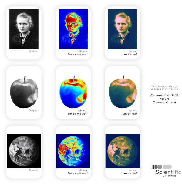
A simple test is to think if you printed the results in black and white - would you be able to tell the difference between the high and low parts of the data? Another example is taking a well-known image, such as a person - here, Marie Skłodowska-Curie - in black-and-white and comparing it to what it looks like in a rainbow map (“jet”), a scientific alternative (“batlow”). It is clear that the scientific alternative batlow does a much better job than the rainbow jet to recover the original image.
Another major reason why unscientific maps should be stamped out, is that they are unreadable to those with colour blindness - 0.5% of women and 8% of men worldwide are estimated to have a form of colour vision deficiency. As an example, the modelled trajectory of a hurricane or flood intensity warning are repeat rainbow offenders - but how can those with color-vision deficiencies discern this information when displayed with a rainbow-like scale?
There have been several notable efforts by the scientific community to produce scientific colouring options, such as Colorbrewer and CMOcean (see paper for more). Researcher Fabio Crameri is one scientist who has been advocating for the use of scientific colour maps, and creating free, easy-to-use alternatives, for several years. In this latest “Perspective” Nature Communications piece, along with fellow Centre for Earth Evolution and Dynamics (CEED; Uni. of Oslo) colleague Grace Shephard and collaborator Philip Heron at the University of Durham, they explore the colour maps, contributions by the community, and present some clear guidelines and resources so that scientific colour maps prevail. Don’t forget to check out the supplementary material!
Contact: Fabio Crameri. Email: fabio.crameri@geo.uio.no
Publication details: Fabio Crameri, Grace E. Shephard, Philip J. Heron. (2020) The misuse of colour in science communication. Nature Communications. doi:10.1038/s41467-020-19160-7
The scientific colour maps are openly available from www.fabiocrameri.ch/colourmaps and archived on Zenodo (DOI: 10.5281/zenodo.1243862).
Funding sources: F.C. and G.E.S. acknowledge support from the Research Council of Norway through its Centers of Excellence funding scheme, Project Number 223272. P.J.H. receives funding from the European Union’s Horizon 2020 research and innovation program under the Marie Skłodowska-Curie Grant Agreement 749664.